Next generation industrial grading

Truesort

Industrial grading of produce is the backbone of a healthy food economy. Ellips develops first-class grading software that inspects produce on size, weight and internal and external defects. After years of feature-push and double digit growth, complexity of the application grew exponentially.

Goal

Design a standardized journey made for future growth. Simplify the journey for most users, extend it for power users. Key challenges to address:

  • High throughput, 25 products per second with 10 images per product over 40 lanes
  • Distribution model, within seconds decide the destination of the product
  • Monitoring, how to aggregate data to empower key decision making
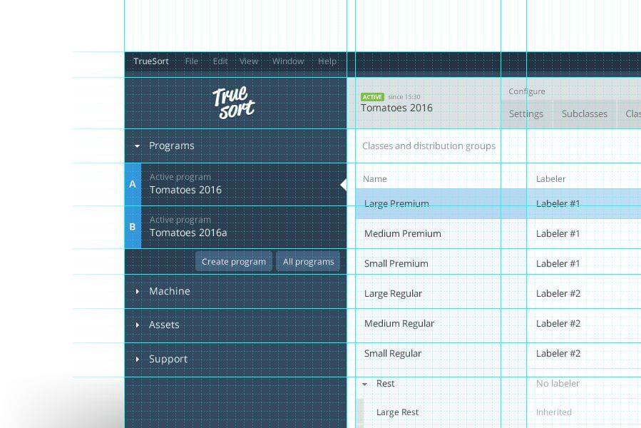
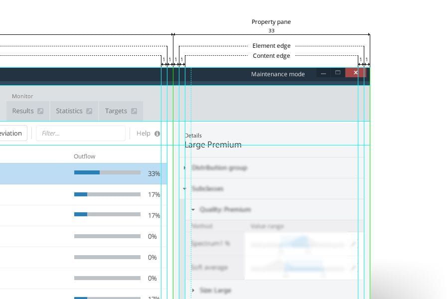
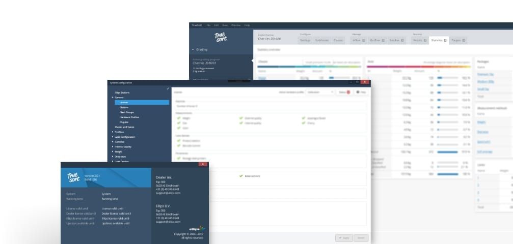
  • Legacy software, application is spread over 120 (!) dialogs

Identifying patterns

Expansive complexity is rarely necessary: it's a sign of no clear strategy, mental models or focused journey. Feature push exacerbates this problem by iterating over a flawed journeys with one-offs. Identifying patterns is key to discover main journeys in the software.

Statistics overview page

Carving key journeys

The features of the application were tightly interwoven, creating overlap and ambiguity between tasks, significantly increasing the perceived complexity of the application. Categorizing and grouping features to establish clear user journeys was done through affinity and customer journey mapping.

Grouping functionality through a distinctive visual language

Visual hierarchy

The legacy application already had a defined hierarchy of functionality both enforced in code and in mental model. However a clear visual language was missing to communicate that hierarchy to the end user. Effective design plays a key role in communicating complex structures and hierarchies. Establishing a visual language and re-usable ux patterns the application becomes more readable and predictable.

Accordions & tabs working to visually group the application

Progressive disclosure

One of the core improvements: carefully distinct between primary and secondary information. Disclose primary, hide secondary information. 20% of the features are used 80% of the time.

Properties pane with clear hierarchy

Documentation

Implementing a redesign of this magnitude is a multi-year project that requires coordination and documentation to be executed effectively. The design system and visual language have been documented thoroughly in a simple yet effective way.

Design system is based on a 12px grid Grid based design allows for satisfying horizontal and vertical rhythms

Result

The deliverable of the project was a well-documented new design system and visual language. Initial response of end-users was very positive and instill trust in the chosen direction. From early user-tests the result users where significantly more efficient in executing provided tasks.

A selection of windows from the TrueSort application